Monday, October 12, 2009

The Dawn of a New Setting


One of the problems with custom Left 4 Dead maps is that majority of them share the same look. They all use the same in game assets and create brothers and sisters for the No Mercy campaign. Now, there's nothing wrong with recreating the No Mercy city look, but players are often getting tired of this style.


Granted, zombies in a city really don't have any other type of defined style besides a rainy stormy night in a power deprived city. But still, players are getting tired of seeing No Mercy rehashes, or any rehash of any of the old campaigns. But this leaves map makers at a particular problem, all of the assets that we use were made for all those familiar tired settings in mind. What kind of new environment could you make that would be refreshing and interesting at the same time?

Well the obvious answer is to change the time of day. Infact, many players have suggested and some map makers have even started to create daylight themed environments. Even "The Parish", a new campaign in Left 4 Dead 2 makes use of the sun to create a relaxing sunny day of killing zombies.


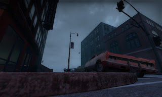
So obviously, I wanted to create a different look for my campaign that will draw some interest and won't draw people away. Rather than stick with sunlight, I wanted to blend the lighting setup in the rural Blood Harvest campaign and mix it with the city environment of No Mercy to get this:


Setting the environment in a windy dawn setting gives the map a moody look that is cold and creepy. The current idea is to mix orange/red lighting on top of the blue ambient to create a visually appealing atmosphere.

Sunday, October 11, 2009

The Iterations of a Spawn Room


The concept of the first area of the map is a apartment room that's been held up by the survivors for awhile. While looking at the window they hear and see some sort of military checkpoint activity up ahead and decide that moving out would be the best option.

From a gameplay perspective, this room is really simple, the survivors start in a kitchen area and make their way around the kitchen to outside of the apartment room, soon to see how the local zombie virus has trashed up the rest of the apartment.

But visually, this is a defined moment. This is what people playing the map will see the first time they play it, so making a good first impression is certainly a must.

Before building anything though, I needed reference pics. Now, I'd like to say I'd know exactly what a apartment complex would look like and all of the fine details within one, but references help you see details your mind would miss and help create the believability of the environment, which is something Left 4 Dead needs from its environment. Combining the craziness of zombies to the standard things we see all the time is one of the key concepts visually for Left 4 Dead, so to have a unrealistic environment just tears apart this concept.

For my reference I used this collection of pictures I found on flickr:

http://www.flickr.com/photos/corgi_t/541912797/

These pictures show a pleasant enough apartment room. So here goes the first iteration:


It looks humble, but kind of bland. On feedback I got back, it seemed this area didn't really stand out visually. And it should, since this is the first area that players will be running around in.

One of the lighting methods Left 4 Dead uses almost religiously is spotlights. Spotlights are able to create a atmosphere. They can light up areas while still having areas in the dark, and they can also communicate subconsciously to the player.

So the decision was made to try and change the lighting setup and give the kitchen a spotlight,


The mood of this kitchen is now much better. But one of the evident problems that became apparent was that the counter top was now particularly dark. This is where the medkits and the weapons would be at and having this area dark would probably cause some misguided players to actually run through and ignore the weapons and medkits, which is bad in any gamemode in Left 4 Dead.


A lantern was placed ontop of the countertop to properly light the medkit and weapons. The living room area was also going to originally be lighted, because this apartment room is meant to be pretty normal in contrast to the rooms later on in the map. But I decided that having the living room dark would better contrast the kitchen lighting, and also would guide players who move into the living room to the lighted hallway, which is the exit to this particular area.

The living room also has a nice vista that shows that rest of the map. The intro camera will fly from down on the street to up to this window and to the kitchen, so its important that this window has a nice view.


Finally, this is what players starting the campaign should see as they first start up the map:


Wednesday, September 30, 2009

L4D Map Layout Sketches. - First Map-

Here are some sketches I've made detailing the more than likely going to change layout of the first map. Click the Pictures for Larger Views. With these, I shall start making the base structure of the map layout.